
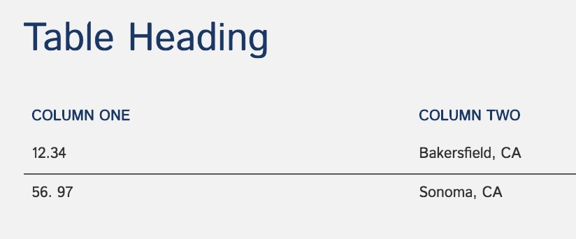
| Column Header 1 | Column Header 2 | Column Header 3 |
|---|---|---|
| Row 1, Column 1 | Row 1, Column 2 | row 2, Column 3 |
| Row 2, Column 1 | Row 2, Column 2 | Row 2, Column 3 |
Content Row: Responsive Table
The Responsive Table allows for a table of up to five columns that is ‘responsive’ in its design. In other words, the table layout changes systematically based on screen size.
Form
The section heading provides a heading <heading 1> for the Table as a whole.
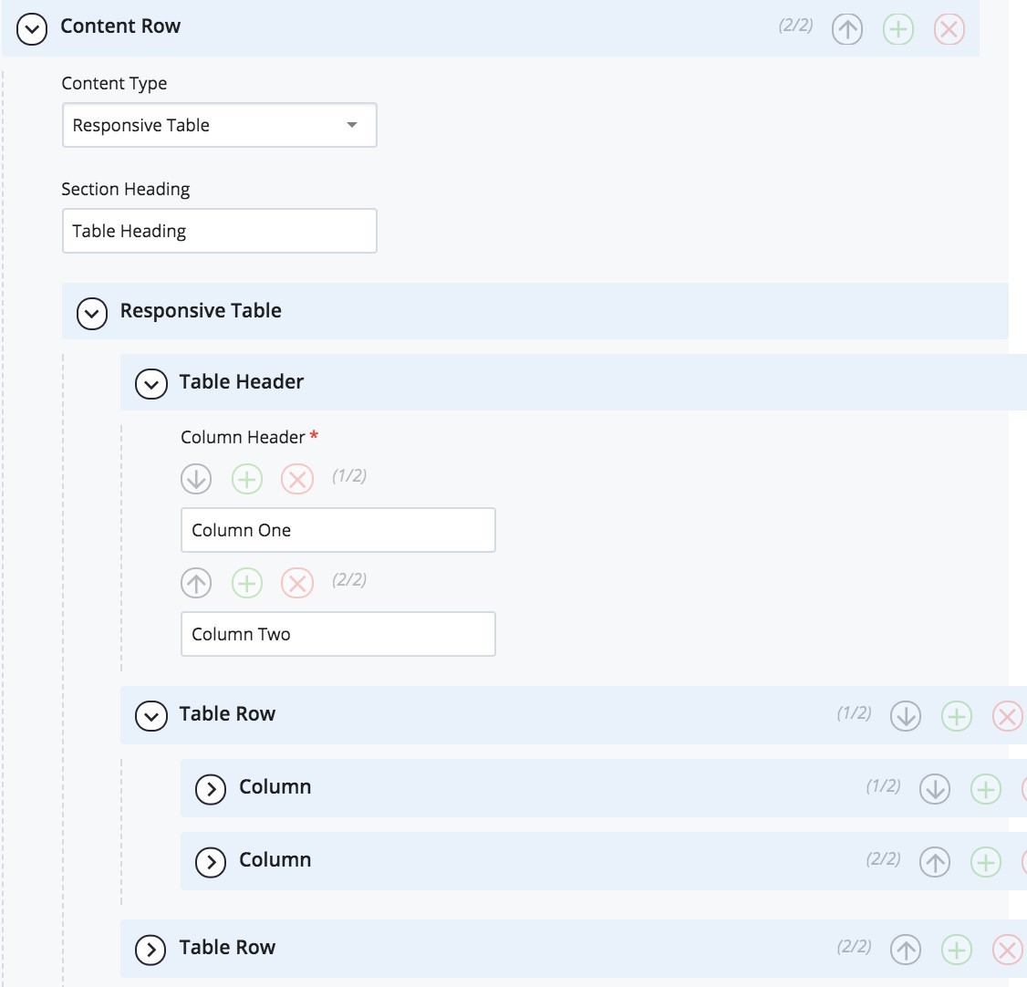
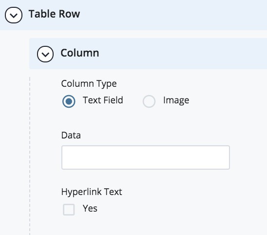
Under the “Table Header” section one can add and rearrange multiple Column Headers - up to five columns are allowed. Finally, one adds Table Rows with a Column field for the content for each column in the row.
To add a row or column, select the green (+). To remove a row or column, select the red (x). Rows and Columns can be rearranged by selecting the arrows.
The data filed of the column can be a hyperlink.
Best Practices
- Table headers must match the number of columns in each row. If you have 3 table headers, then each row should have 3 columns.
- It is easier to make multiple small tables than to make one large table.
- Tables are for data and NOT for design or layout.
- Keep data field succinct.


